Found within the Security menu, which is where the system administrator creates and manages users, user groups, and the assignment of components to groups, the User Management screen is dedicated to managing all aspects of individual users.
This article includes an overview of:
- Navigating the User Management screen
- A quick view of user details
- Adding a new user
- Editing an existing user
- Reviewing user access
Navigating the User Management screen
The User Management screen is the default screen when entering the security menu, but also can be navigated from elsewhere within Security by clicking on the user icon (![]() ). Within this screen, users can be created, updated, including assigning the user to user groups, and deleted.
). Within this screen, users can be created, updated, including assigning the user to user groups, and deleted.
Prior to Syntasa 5.2, the user management functionality is found under the Profile menu.
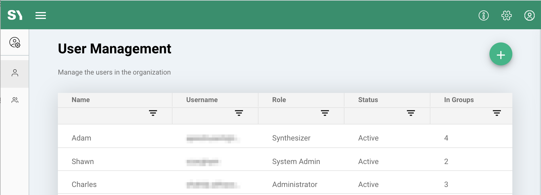
Most of the information found in the grid seen above is self-explanatory, e.g. name, username, role, etc., but is also detailed in the article describing the Profile screen.
A couple of additional fields seen here are:
Status - This field is a misnomer at the moment as there is not yet an ability to inactivate a user. Therefore, all users seen here will always show the value of Active.
A system administrator can either change the password of a user to "inactivate" them or use the trash can icon (![]() ) at the far right of the row to delete a user from the system.
) at the far right of the row to delete a user from the system.
In Groups - The value displayed here represents the number of user groups the user has been assigned. The apps and resources can be assigned a sharing option of Public, Private, or Group as described in the sharing options overview article.
A quick view of user details
Clicking on a row of the user grid provides a right panel displaying the details of the selected user. Much of the data seen here is also seen on the grid, e.g. username, email, role, but the information also provides more details on the individual user groups that the user is assigned.
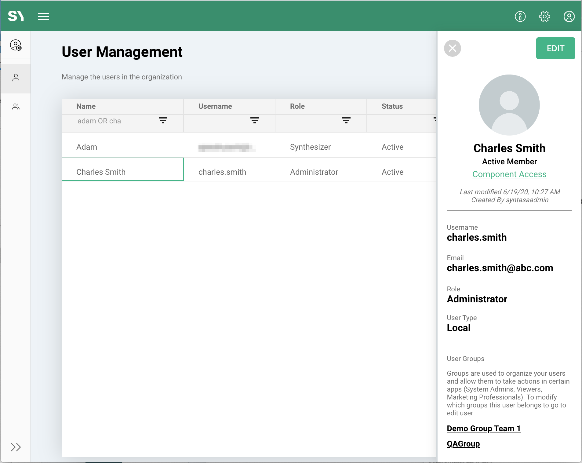
Also, from the panel there are three navigation possibilities:
Edit - The edit button (![]() ) will navigate to the detailed configure screen of the user as described in the below section Editing an existing user.
) will navigate to the detailed configure screen of the user as described in the below section Editing an existing user.
Component Access - Also available after clicking the edit button, the Component Access link provides a shortcut to view the components a user has access to as described in the below section Reviewing user access.
User Groups - Clicking on an individual user group name will navigate to the configure screen of the group. This is detailed in the Group Management article.
Adding a new user
Adding a new user is performed by clicking the green plus button (![]() ) within the User Management screen. Clicking this will provide the pop-up seen below to enter the needed values and select the desired user groups.
) within the User Management screen. Clicking this will provide the pop-up seen below to enter the needed values and select the desired user groups.
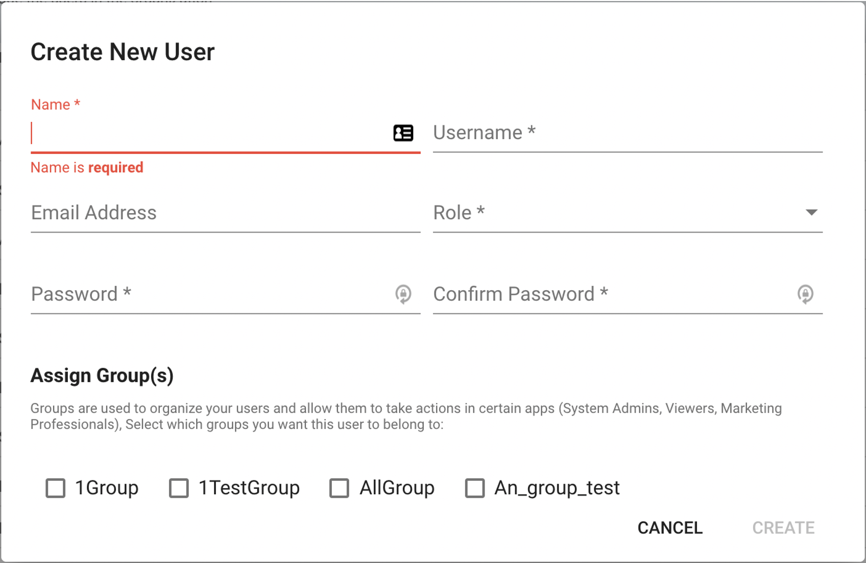
All fields can be altered or reset later via the edit button available noted in the A quick view of user details section above and detailed in the section below.
Editing an existing user
Clicking the edit button from the right panel of a user, mentioned above, navigates to the configuration details of the specific user. The configuration section can also be reached by clicking the configure icon (![]() ) if already within the details of the user, but in a different section, e.g. the access section of said user.
) if already within the details of the user, but in a different section, e.g. the access section of said user.
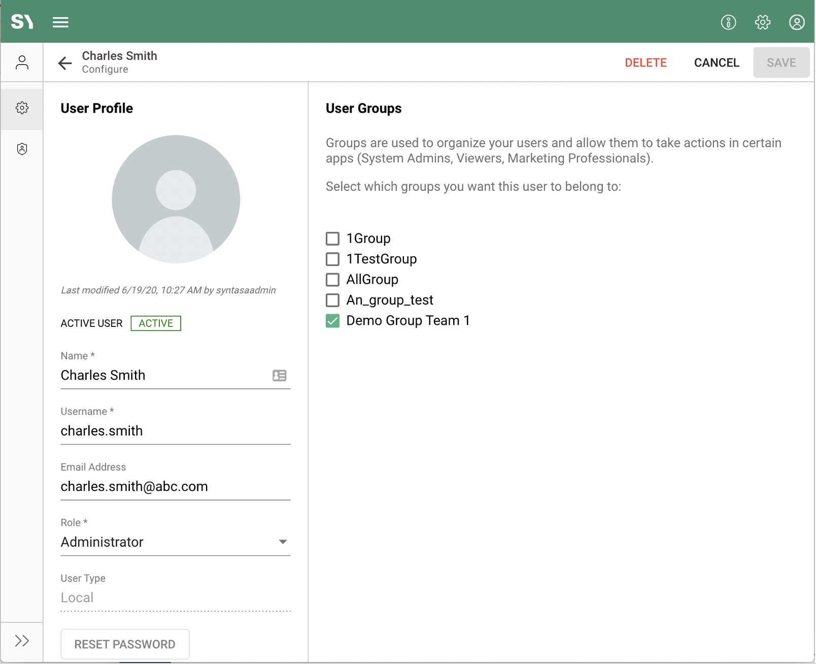
Within the configuration section of a user, the system administrator can alter all fields provided at the time of creating the user as well as alter the user groups the user is assigned.
Certain user-specific fields, i.e. name, email address, and password, can also be altered by the individual user via the Profile menu.
The user group assignment can be altered here for the individual user, i.e. add this user to multiple groups at the same time, but also the users that are assigned to an individual user group can be altered in the Group Management screen.
Reviewing user access
Clicking the Component Access link from the right panel of a user, mentioned above, navigates to the access details of the specific user. The access section can also be reached by clicking the access icon (![]() ) if already within the details of the user, but in a different section, e.g. the configuration section of said user.
) if already within the details of the user, but in a different section, e.g. the configuration section of said user.
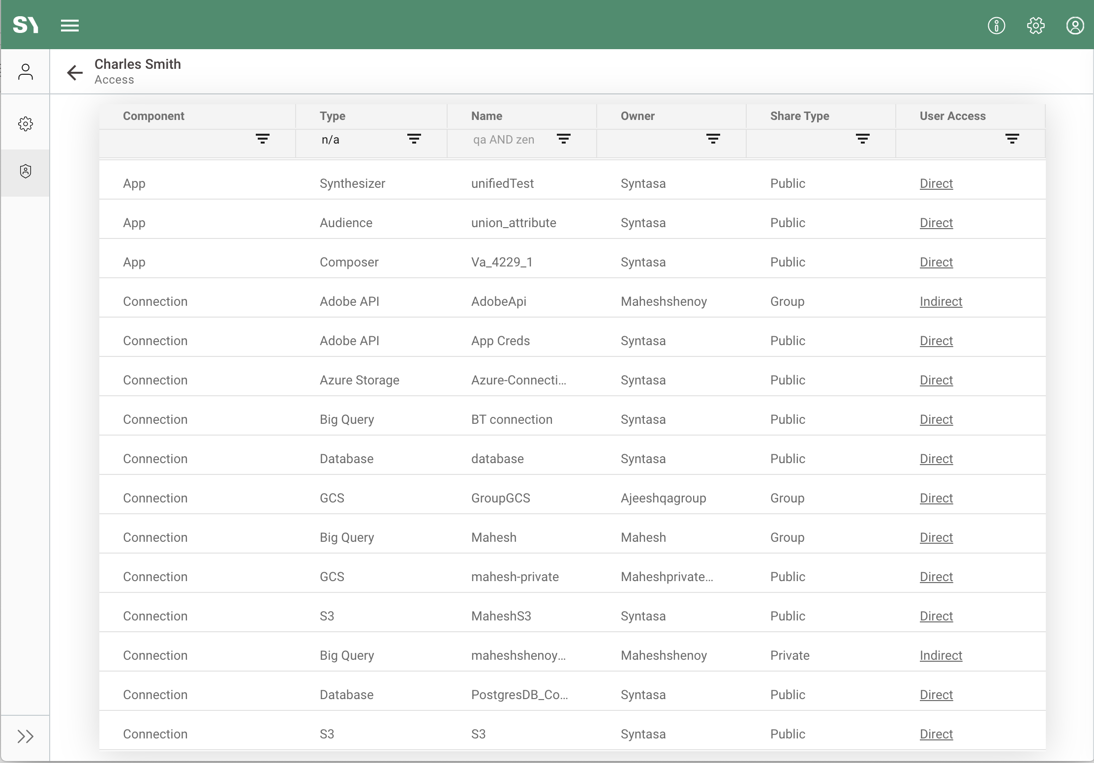
Reviewing the list of components user has access to
Within the access section of a user, the system administrator can view the apps and components the user has access to and the method by which the user has been granted access to said app or component.
Component - Specifies the type of item the user has access to. Possible values are the following: App, App Dataflow, Connection, Data Layer, Event Definition, Runtime Template, Store.
Type - Details the type of component, where applicable. For example, if the component is an app, the type will detail the module of Synthesizer, Composer, or Orchestrator; if the component is a connection, the type will detail the connection type of GCS, BigQuery, S3, etc.
Some components, e.g. Data Layer and App Dataflow, do not have specific types and therefore the type will be shown as N/A.
Name - This is the name of the component that the owner has given at the time of creating the component or a user has changed at a later time.
Owner - The owner of the component, which by default is the creator of the component, but can be changed after it has been created by the owner or the system administrator. This is important as the owner (and system administrator) controls the sharing option of the component.
Share Type - Displays the sharing option the owner or system administrator has selected for the component, i.e. Public, Private, or Group, as described in Using sharing options article.
User Access - Also described in the Using sharing options article, this specifies whether the user has direct or indirect access to the app or component. Clicking on the value Direct or Indirect will display details of the component and the access for the user.
Direct Access
Direct access will be noted if the component is owned by the user, shared publicly, or shared with a user group that the user is a member of.
For example, user Jane has created an app ABC and shared it publicly. For a different user, Jack, the app will be displayed as direct access.
Indirect Access
Indirect access will be noted if the component is set to private or shared with user groups that the user is not a member of and the component is embedded in a different component, e.g. an app, that the user does have access to.
For example, if the app ABC uses a connection created by Jane that is set as private, the connection will be displayed as indirect access for Jack. If Jane has created another connection that is set to private or to user groups that Jack is not a member of and the connection is not used in an app that is shared with Jack then the connection will not show up in this access screen for Jack.
Reviewing details of a listed component
Clicking on the value of the User Access column, i.e. Direct or Indirect, will display more details about the component and how the user has access to it. There are three main sections of information available, component details, user group(s), and means the user has been granted access.
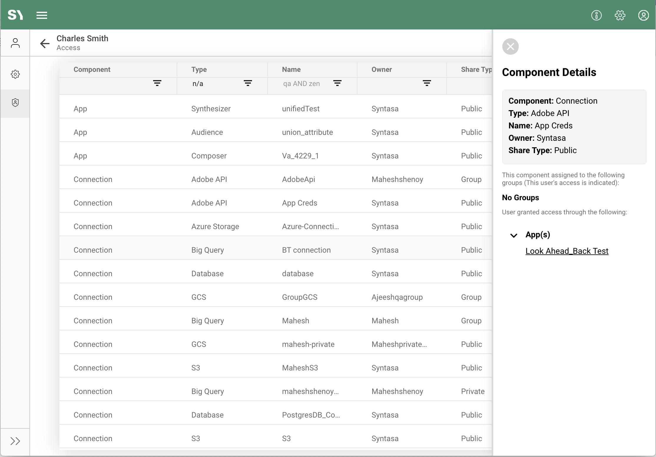
The below screenshot are only a few examples of the many variations of the information that can be displayed in the detail panel. The information in each section is described below.
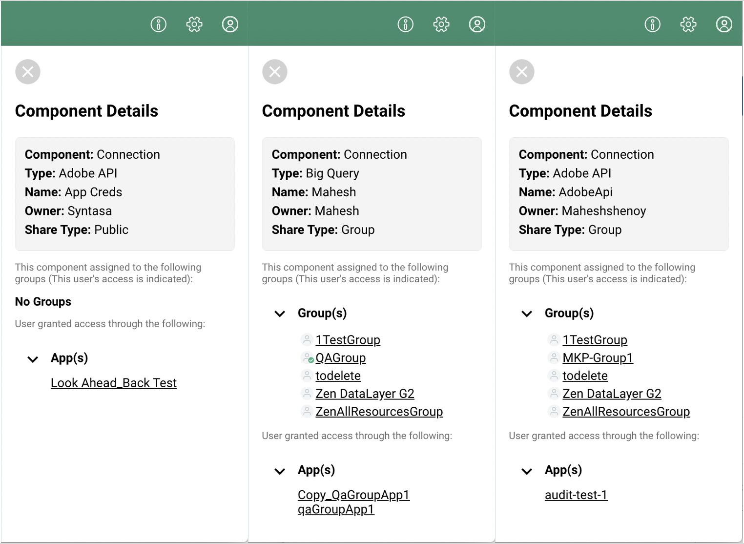
Component details
The component details section at the top of the panel simply reiterates the attributes of the component itself. This is the same information about the component that is shown in the grid.
User group(s)
The user group(s) section will display all user groups the component is shared with. This information is only applicable if the share type of the component is set to Group. Otherwise, it will display No Groups.
If the component has a share type of Group and the user access for the said user is Direct then the user will be assigned to one or more of the user groups that the component is shared with. The user groups that the user belongs to will be indicated with a green checkmark icon (![]() ); other noted user groups are those that the component has been shared with, but the user is not a member.
); other noted user groups are those that the component has been shared with, but the user is not a member.
If the component has a share type of Group and the user access for the said user is Indirect then all listed groups with have the user icon without the green checkmark (![]() ) since the user only has access to the component via another method.
) since the user only has access to the component via another method.
Means the user has been granted access
The last section details where the selected component is included in other components that the selected user has access to. For example, if clicking on a connection that the user has indirect access, the user does not have direct access to the connection but can see the connection inside, for example, the listed app(s) that are shown in the bottom section of the panel.
Apps are the most common parent component that will be housing other children components and thus be shown here, but other parent components that can also provide indirect access to other children components include dataflows, event definitions, and data layers.
For example, when creating a dataflow a number of apps are selected to be included in the dataflow. The dataflow can be shared publicly or with user groups, but all included apps may have more restrictive sharing options. Therefore, an app will be noted as indirect access if it is not directly shared with the user but can be seen within a dataflow that is shared with the user.